As promised, my friends, here is part two of my adventures in Coverland.
Last time I stopped at the point where I decided I needed to see my cover from a different approach. As a result, I oriented towards a more abstract/vectorish looks. No more stock photos for me.
At first I wanted to have a microphone as the focus of my cover, but I soon changed my mind. I didn’t find microphone illustrations for commercial purposes, I didn’t find brushes that I liked. So I said “Never mind, i’ll just do something cute, even though it might be unrelated with the story.”
That’s how this cover was born:
I used a free commercial font, a free music notebook texture and flower brushes that I made myself.
After I shared it with my friends, they all commented on the pink. no pink for us, lady, thank you very much. *Sigh*
No biggie, I’ll make it purple.

Basically all I did was play around with layer modes, hue-saturation, curves, etc. I liked it a lot. Deb commented on the flowers though. now that they popped, she suddenly realized they had no place in the pictures. It made no sense for them to be there.
I didn’t really understand her logic, I admit, but I’d rather trust someone else’s opinion than my own when it comes to unexplored territories, and this was definitely an unexplored territory for me.
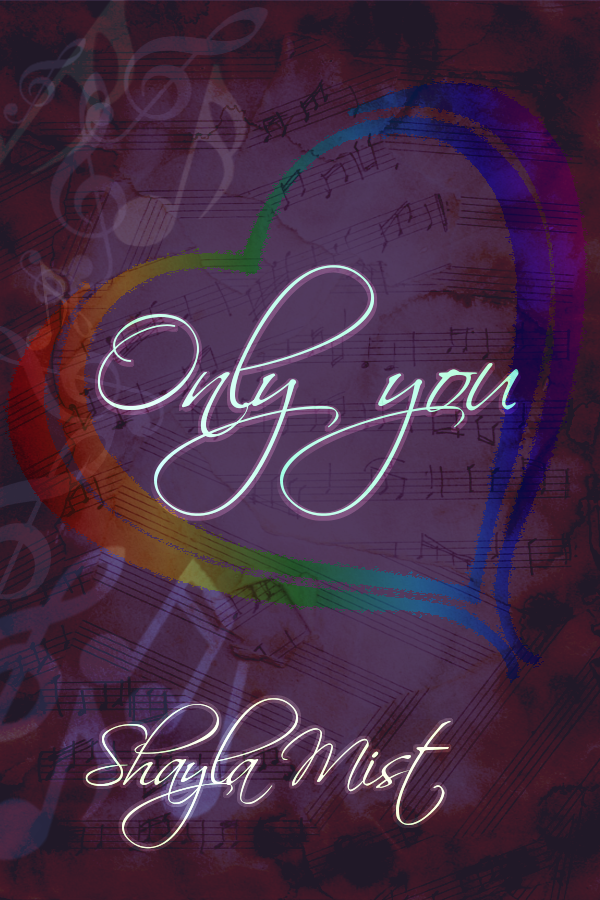
So I took the flowers out and came back to the main idea of my book. What was my book about? Two best friends. One of them is singer that uses his unrequited love to fuel his passion for music, the other one comes out for him in the end. It’s that simple.
I thought I could convey this with the use of the rainbow’s colors and some music notes.
I made various versions of the cover, some of which I have deleted . Here’s what I kept.


I apologize, but I’m too tired now to modify the damn HTML so the pics show in one row. I swear I’m sick of blogger. It may be easy to customize sometimes, but other times…
Anyway, end of rant, back to topic. I again showed these to Deb. She pointed out that having some guitar picks and drums would be better. I didn’t agree with this one because they had very little to do with the story. She even showed these covers to her students and they all agreed on the third from those above I believe. I’m not sure exactly because I deleted a few.
At this point I showed the cover to Vess. Vess immediately said she thought it was too dark. She suggested I enlarge and right (righten?) the heart in the middle. cange the layer mode a bit. This is how I came with the above fifth cover.
Well, Deb was very very helpful. But I felt that the cover had a too many things thrown on top of each other. I returned to the initial idea of something simpler.
It was then that Vess saved me again. She showed me a wallpaper with a rose and a text in a circle. It looked gorgeous, simple. Beautiful. I thought about it a little and I decided I could do something similar. With the use of a rose picture I had with my own garden roses and a few free brushes, I made this:

Vess loved it. But “What’s the blood got to do with it?” she pointed out. Oops. Maybe I shouldn’t so obviously point at bleeding heart. some might take it literally and confuse it with a mystery story.
So I changed it. unfortunately I deleted the last file. I had a few falling petals, but they fell upside down. I noticed it thanks to Vess again. In the end, I corrected the mistake, deleted a bit more of the gray area, and ended up with this:

So, this is my final cover. I did not write “an LL story” or something like that as other authors did, simply because I forgot. I wanted to be done with it, otherwise, knowing me, I knew I’d end up tweaking it endlessly.
So, this was the story of my first self-made cover.
What I learned from this experience?
First and foremost, NEVER do it alone. I had three awesome friends who helped build this: Louise, Deb and Vess, who all pointed out my mistakes and gave priceless advice. I would have ended up with a mess if not for them.
Secondly, go with your first instincts.
From the start, I wanted something simple and minimalist. No matter how many ideas I bounced back and forth with everyone, no matter how many versions I came up with, I was still attracted to the simple cover. I could have saved myself a lot of time and effort and spared my friends a lot of eye rolls and huffs if I’d just stuck to my first thought and worked around that.
Third, if you don;t know what you’re doing, go with simple. I might not have the greatest cover. But for a beginner, I think it looks good. As long as it’s simple, your rookie mistakes will be reduces to a minimum. It won’t be so noticeable that you have no idea what you’re doing. Monochromatic is also a good way to avoid bad result. As you can see, I went with both to minimize my risks LOL
If you can make it free, go with it. You can have a cute cover even for little or no money. for this cover I made my own rose brush from a photo. I used free for commercial use font from 1001fonts.com (click the green dollar button) and free for commercial use brushes from Obsidian Dawn .
Lastly, don’t forget to give credit, even if it’s not required, for the resources you use. It’s common sense.
Well, thanks a lot for following me through my adventure. I’d be honored if you’d like to share your covers with me.
Lots of hugs and kisses,
Shayla


